Volatility Viewer #
This was created as part of a hackathon in late October 2022. This was my first foray into anything data-science and web app related, and I really enjoyed it.
We created a web app that would attempt to explain or predict economic volatility (measured by the VIX) through indices such as the federal funds rate, S&P 500, and mortgage rates. I was involved in the story creation aspect. I simply gathered all sorts of data and tried to find strong relationships to volatility.
For the sake of brevity, I am only showing a few graphs here.
You can check out the full project at the github
Federal Funds Rate #
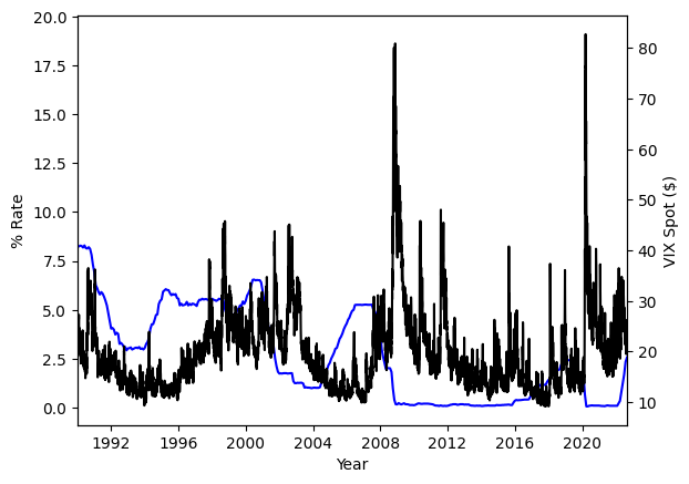
One of my favourite graphs. You can see that the VIX (black) lags behind the federal funds rate (blue). You can also see the length of the lag varies. From about 5 years in 1996-2000 to only a couple years post 2004-2008. You might also be able to notice VIX spiking when the federal funds rate change too quickly.
The two spikes in 2008 and 2020 are the great recession and the COVID-19 pandemic respectively.
SPY #
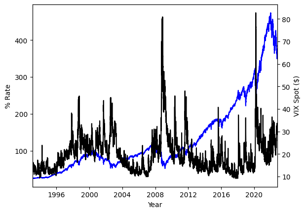
This was a easy graph to analyze. You can see that VIX (black) rises whenever the S&P 500 (blue) dips. This behaviour is quite expected, but I wasn’t fully sure how to represent it.
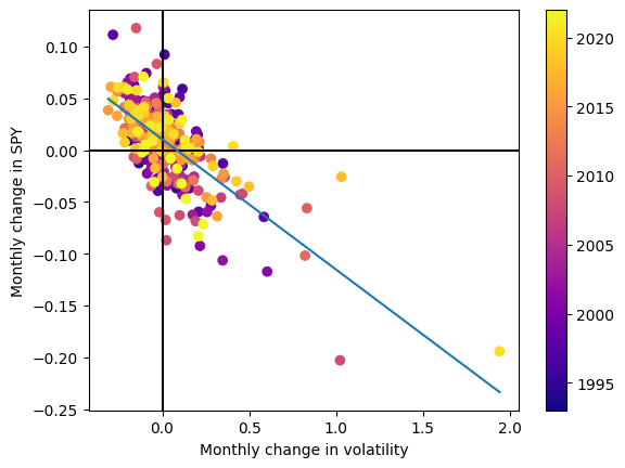
I eventually showed this relationship by creating a scatter plot of the monthly change in VIX vs SPY. There ends up being a moderate negative correlation between the two of -0.69. This means that when SPY goes up, VIX goes down, and vice versa. Again, not ground breaking, but combined with the federal funds rate analysis, one can see that can already be a bit complicated.